


Help article
Forms - Simple, flexible and interactive
Description:
Create suitable forms for e.g. registrations, queries, requests for quotations, etc. Define the necessary texts, numbers and selection fields, including a suitable name. Determine which fields must contain mandatory information and define a recipient e-mail.
Handling:
Introductory text (optional) - Use an introductory text to provide app users with a brief explanation of the purpose of the form. For example, store formatted text, including images.
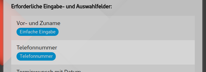
Required input and selection fields - A few lines are sufficient to define the required fields.
Define the fields in descending order. Starting with the field types explained below and the name of the field, one field is defined for each.
| Field type | Meaning and use |
|---|---|
| Simple entry | Single-line simple text or numbers. |
| Numbers only | Exclusive input of numbers (e.g. quantity) |
| Select / send images | Allow images to be sent directly within the app and when filling out the form. One or several images can be selected at the same time. Depending on the smartphone and environment, pictures can be taken and sent via the camera. (Requires higher app package) |
| Attach documents |
Allow you to attach documents of any kind (e.g. PDF, Word, Excel, etc.) directly within the app and when filling out the form. One or optionally several documents can be selected at the same time. (Requires higher app package) |
| Selection menu | Represents a selection for several options. To define the selection points, simply append the possible options below the field name. |
| E-mail address | Only one e-mail address may be entered. If you enter the wrong one, a message appears in the app. |
| Phone number | Like field type "Number" but with special characters "+,(,),/,-" |
| Content field without input | No input field. Only shows the stored information. This can be used to separate a section and provide further explanation. |
| Password | Corresponds to the "Text" field type. All entries are represented within the app by a "*" character. |
| Multi-line input | Also corresponds to the "Text" field type. Enables the entry of multi-line text. For additional comments or special requests, for example. |
| Date selection | Allows you to conveniently select a date. |
| Date incl. time | Selection of the date plus a time of day via an intuitive rotary switch. |
| Time of day | Selection of the time of day only. |
| Yes/No toggle switch | Corresponds to a switch where you can choose between Yes or No, or more precisely, on and off. |
| Selection menu (multiple) | Similar to the conventional selection menu. This only allows multiple selections to be made at the same time. |
If required, you can mark the relevant fields as mandatory and thus require an entry before submitting the form.
E-mail(s) for form responses - Completed forms are sent to the e-mail address(es) entered here. If this field is left blank, the form will be sent to the centrally stored e-mail address. Several recipient addresses can also be stored, separated by spaces.
Automatic e-mail confirmation to sender - Customers and interested parties who successfully complete your form will receive a separate e-mail confirmation after submitting it.
Delete completed forms after sending - After completing and sending a form, all entries are saved temporarily to ensure a positive user experience so that they do not have to be re-entered the next time. If you do not want this for the respective form, you can deactivate this option.
Procedure for use:
- Decide whether your form requires an additional explanation. Enter this in the introductory text.
- Define the necessary fields and give the fields a concise and short description.
- If the answered forms are to be sent to an e-mail address other than your centrally stored one, set an alternative address.