


Update article
Reach for the stars in a fresh new outfit
Every tried-and-true product deserves the right look. The visual and tactile design of an everyday object is more important than ever.
We’ve long been thinking about how to give the tried-and-true but, in terms of color, outdated basic design a positive makeover.
Good things come to those who wait. From now on, the app management and the admin area within your app feature a fresh new design.
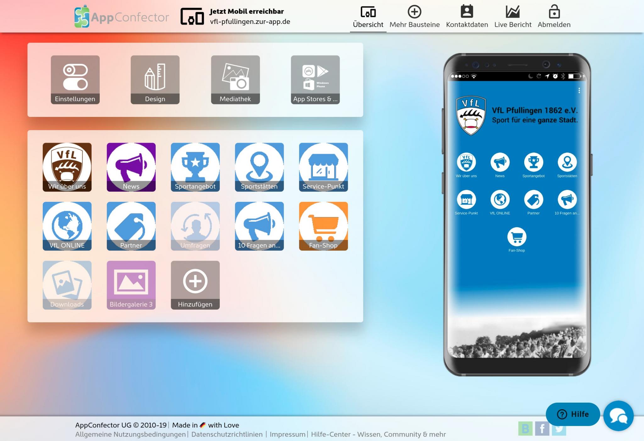
We’ve used as many bright colors as possible to make your daily work more efficient and productive. Give it a try—you’ll feel more comfortable and get much more done, not just subjectively.
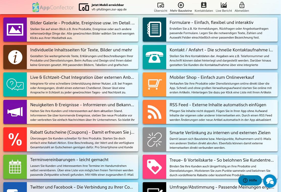
However, the new design is just the beginning; in the coming weeks, you’ll also notice visual and functional changes in many other areas. Let yourself be surprised.