


Blog Article
🧊 GlassKit is here — a new design layer for modern customer apps
Over the past few months, we’ve been asking ourselves a new question: What should modern customer apps actually look like today? This question led to the creation of GlassKit —a new design layer that gives your app a modern, high-quality glass look with just one click. Today, we’re making GlassKit available to all Premium customers.
Why a new design layer?
An app’s visual appearance determines within the first few seconds whether it is perceived as professional, trustworthy, and contemporary. In recent years, expectations for mobile interfaces have shifted significantly—from flat designs to subtle depth, soft shadows, and a calm, high-quality aesthetic, a trend known as glassmorphism.
GlassKit brings this very modern design vocabulary to every customer app powered by our platform. No code, no design effort, no migration project. One click in the AppCenter is all it takes.
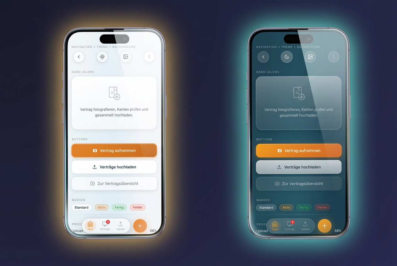
Light and Dark — You Choose the Look
GlassKit comes in two modes, both carefully tuned for readability, contrast, and a consistent brand experience:
- GlassKit Light for a bright, friendly look — ideal for brands that want to convey openness and clarity.
- GlassKit Dark for an elegant, focused look — ideal for premium brands, evening dining establishments, studios, or consulting apps that want to make a calm, focused impression.
Your custom accent color is automatically applied to all GlassKit components in both modes — from buttons and badges to the bottom bar. You manage your brand color in one place; GlassKit applies it consistently.
Six background themes for every brand
Beyond the choice of Light or Dark, GlassKit offers six carefully curated background themes that give the entire app its own unique atmosphere:
- Aurora — soft aurora, ideal as a universal standard
- Ocean — cool blue for clarity and trust
- Sunset — warm orange-pink for enjoyment and lifestyle
- Forest — natural green for sustainability and tranquility
- Rose — soft pink for beauty, wellness, and lifestyle
- Mono — neutral gray for maximum subtlety
Each theme naturally adapts to your accent color—the same brand color looks different on Aurora than on Mono, without you having to adjust anything.
Optimized for modern devices
GlassKit intelligently responds to the notch and Dynamic Island on modern iPhones and makes full use of the screen area without hiding important content behind the sensor area. The bottom navigation is available in three styles: classic continuous, elegantly floating, or as a compact app dock — depending on which style best suits your app.
How to enable GlassKit for your app
If you’re using a Premium package, GlassKit is already available to you at no extra cost. In the AppCenter under Design, you’ll find two new theme buttons (GlassKit Light and GlassKit Dark). Select one of the two variants, choose one of the six background moods—and your new look is live. No need to re-release the app, and no wait time for your users.
Open Source and Transparent Development
GlassKit is not just a modular theme, but also an independent open-source project by Jungherz GmbH. The underlying CSS library is developed transparently and can be viewed and tested on the project page. Those with a technical interest can find all components in detail in the component showcase.
Just the beginning
GlassKit is the first visible step in a larger development effort. In the coming months, further improvements will be added to make maintaining your app presence easier and more effective. We’ll keep you updated via the blog and our newsletter.